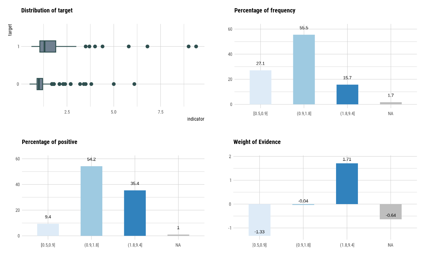
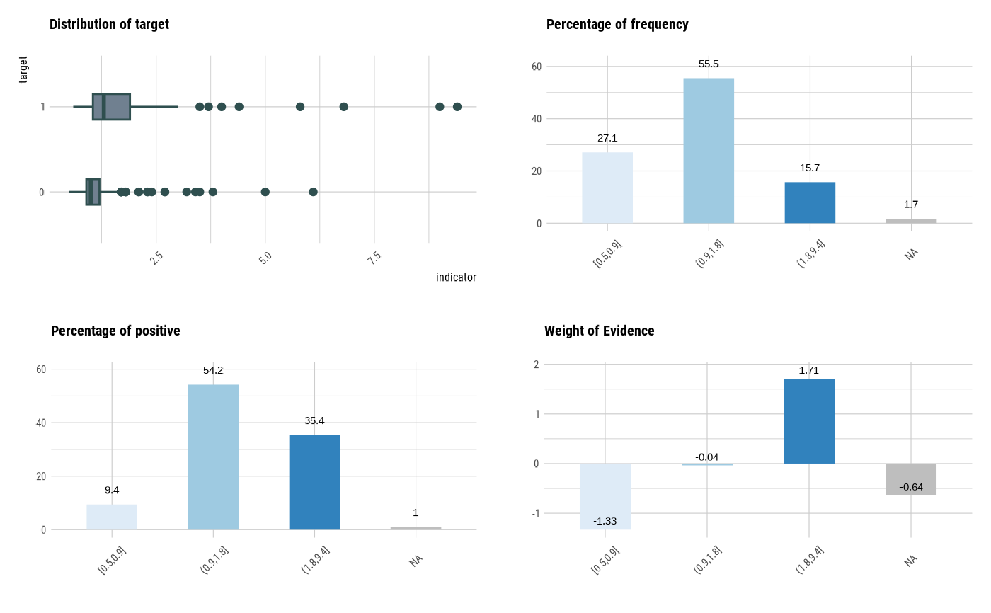
It generates plots for understand distribution, frequency, bad rate, and weight of evidence using optimal_bins.
See vignette("transformation") for an introduction to these concepts.
Arguments
- x
an object of class "optimal_bins", usually, a result of a call to binning_by().
- type
character. options for visualization. Distribution ("dist"), Relateive Frequency ("freq"), Positive Rate ("posrate"), and Weight of Evidence ("WoE"). and default "all" draw all plot.
- typographic
logical. Whether to apply focuses on typographic elements to ggplot2 visualization. The default is TRUE. if TRUE provides a base theme that focuses on typographic elements.
- base_family
character. The name of the base font family to use for the visualization. If not specified, the font defined in dlookr is applied. (See details)
- rotate_angle
integer. specifies the rotation angle of the x-axis label. This is useful when the x-axis labels are long and overlap. The default is 0 to not rotate the label.
- ...
further arguments to be passed from or to other methods.
Value
An object of gtable class.
Details
The base_family is selected from "Roboto Condensed", "Liberation Sans Narrow", "NanumSquare", "Noto Sans Korean". If you want to use a different font, use it after loading the Google font with import_google_font().
See also
Examples
# Generate data for the example
heartfailure2 <- heartfailure
heartfailure2[sample(seq(NROW(heartfailure2)), 5), "creatinine"] <- NA

# optimal binning using binning_by()
bin <- binning_by(heartfailure2, "death_event", "creatinine")
#> Warning: The factor y has been changed to a numeric vector consisting of 0 and 1.
#> 'Yes' changed to 1 (positive) and 'No' changed to 0 (negative).

if (!is.null(bin)) {
  # visualize all information for optimal_bins class
  plot(bin)

  # rotate the x-axis labels by 45 degrees so that they do not overlap.
  plot(bin, rotate_angle = 45)

  # visualize WoE information for optimal_bins class
  plot(bin, type = "WoE")

  # visualize all information with typographic
  plot(bin)
}