The plot_bar_category() to visualizes the distribution of categorical data by level or relationship to specific numerical data by level.
plot_bar_category(.data, ...)

# S3 method for class 'data.frame'
plot_bar_category(
  .data,
  ...,
  top = 10,
  add_character = TRUE,
  title = "Frequency by levels of category",
  each = FALSE,
  typographic = TRUE,
  base_family = NULL
)

# S3 method for class 'grouped_df'
plot_bar_category(
  .data,
  ...,
  top = 10,
  add_character = TRUE,
  title = "Frequency by levels of category",
  each = FALSE,
  typographic = TRUE,
  base_family = NULL
)
Arguments
- .data
a data.frame or a
tbl_dfor agrouped_df.- ...
one or more unquoted expressions separated by commas. You can treat variable names like they are positions. Positive values select variables; negative values to drop variables. If the first expression is negative, plot_bar_category() will automatically start with all variables. These arguments are automatically quoted and evaluated in a context where column names represent column positions. They support unquoting and splicing.
- top
an integer. Specifies the upper top rank to extract. Default is 10.
- add_character
logical. Decide whether to include text variables in the diagnosis of categorical data. The default value is TRUE, which also includes character variables.
- title
character. a main title for the plot.
- each
logical. Specifies whether to draw multiple plots on one screen. The default is FALSE, which draws multiple plots on one screen.
- typographic
logical. Whether to apply focuses on typographic elements to ggplot2 visualization. The default is TRUE. if TRUE provides a base theme that focuses on typographic elements.
- base_family
character. The name of the base font family to use for the visualization. If not specified, the font defined in dlookr is applied. (See details)
Details
The distribution of categorical variables can be understood by comparing the frequency of each level. The frequency table helps with this. As a visualization method, a bar graph can help you understand the distribution of categorical data more easily than a frequency table.
The base_family is selected from "Roboto Condensed", "Liberation Sans Narrow", "NanumSquare", "Noto Sans Korean". If you want to use a different font, use it after loading the Google font with import_google_font().
Examples
# Generate data for the example
heartfailure2 <- heartfailure
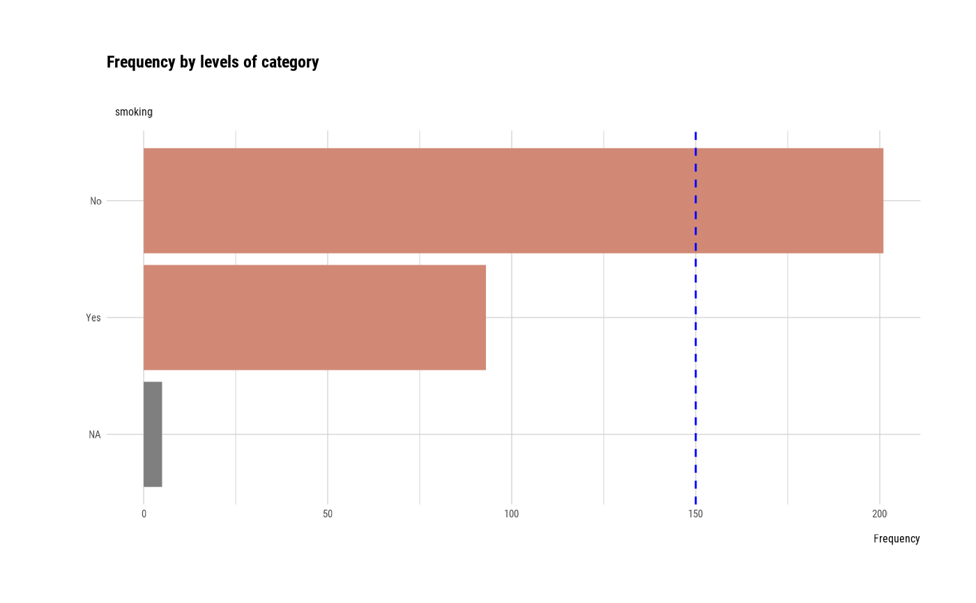
heartfailure2[sample(seq(NROW(heartfailure2)), 20), "platelets"] <- NA
heartfailure2[sample(seq(NROW(heartfailure2)), 5), "smoking"] <- NA
set.seed(123)
heartfailure2$test <- sample(LETTERS[1:15], 299, replace = TRUE)
heartfailure2$test[1:30] <- NA
# Visualization of all numerical variables
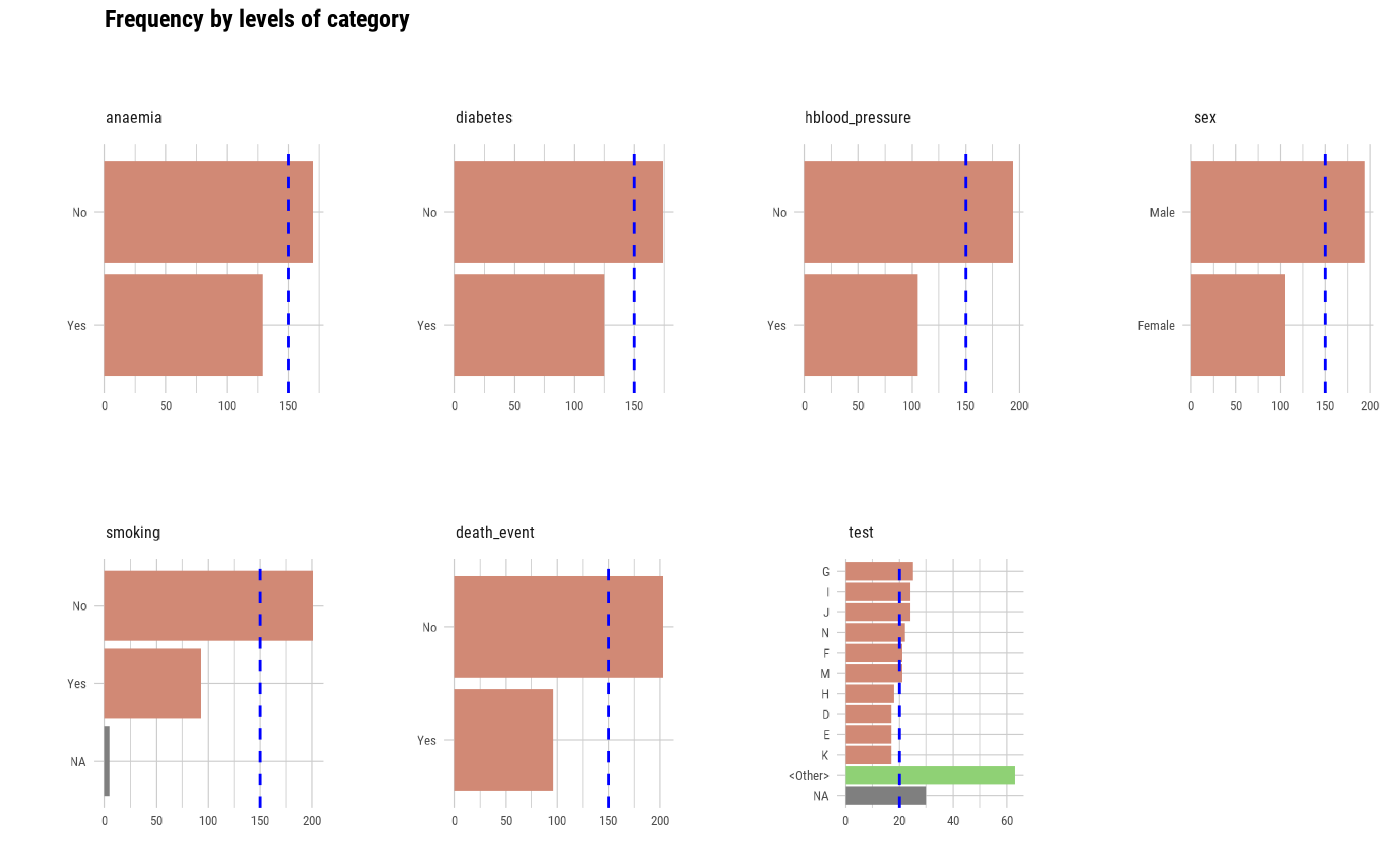
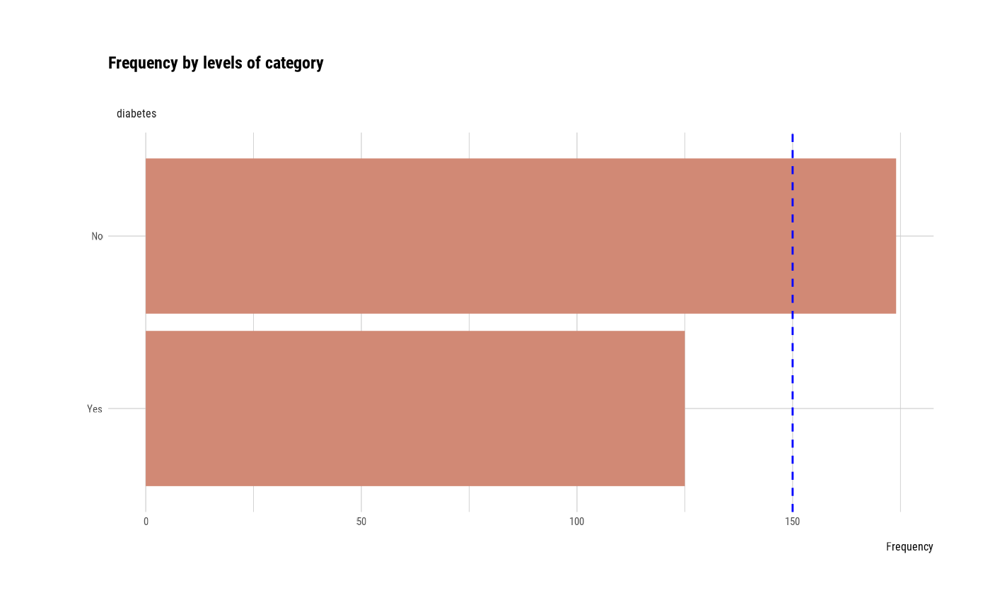
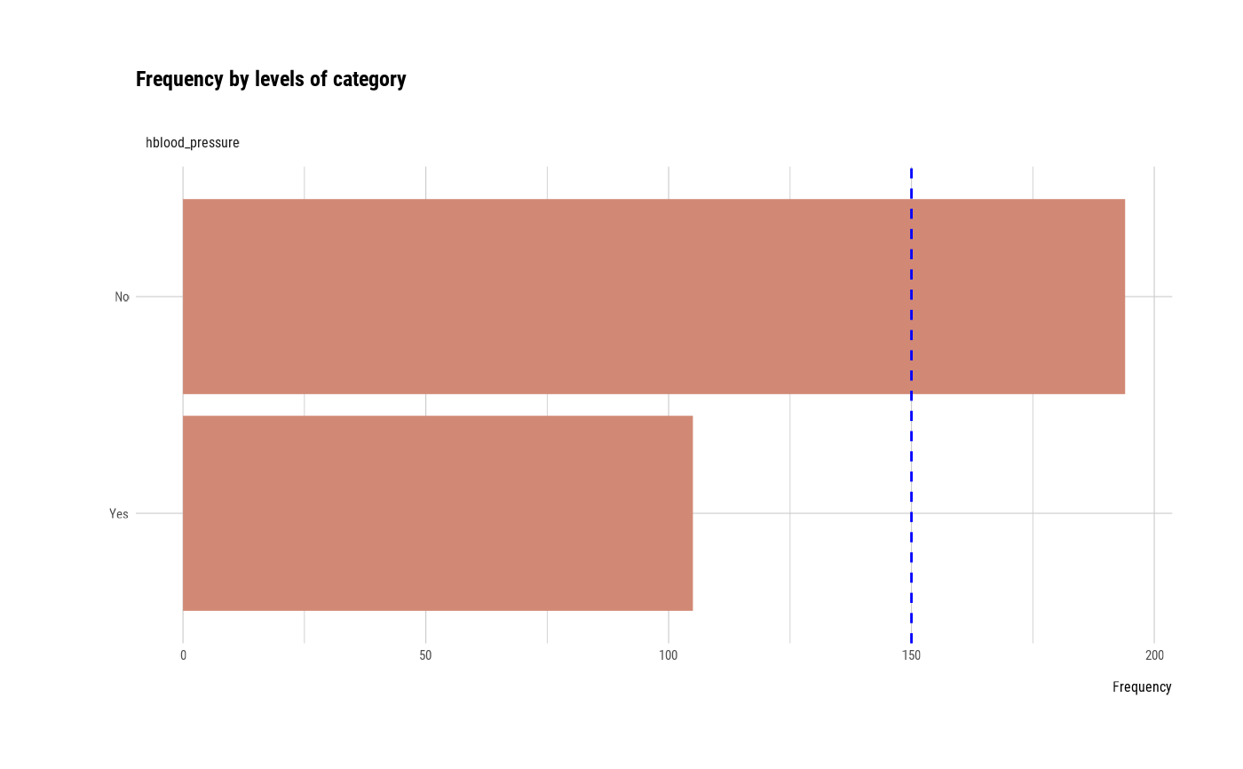
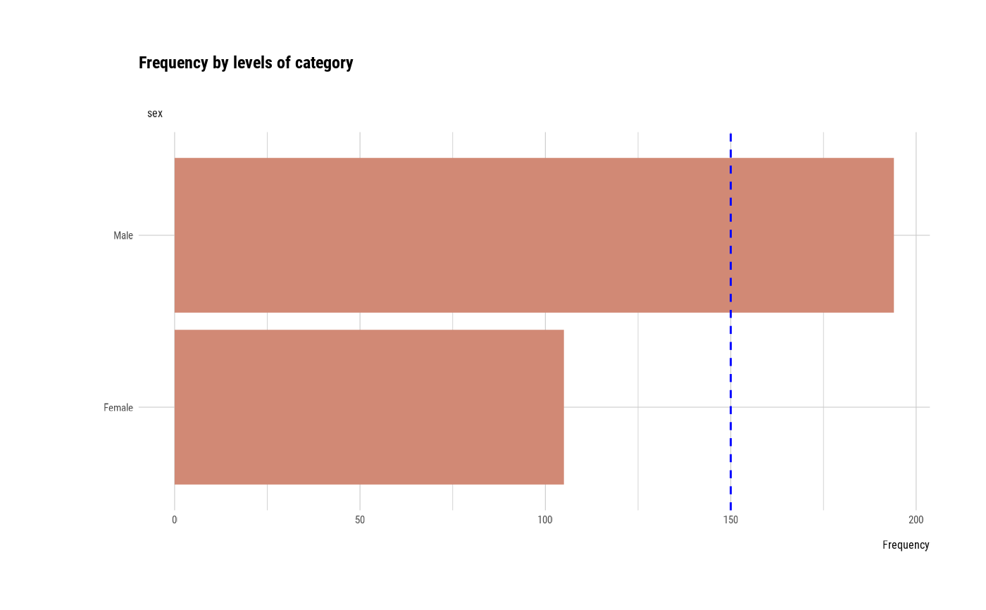
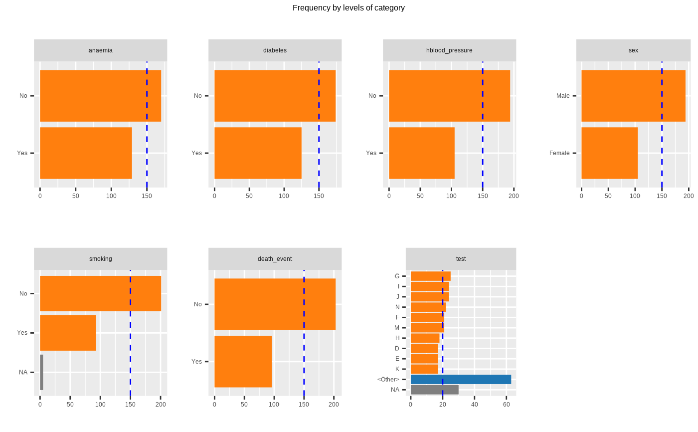
plot_bar_category(heartfailure2)
 # Select the variable to diagnose
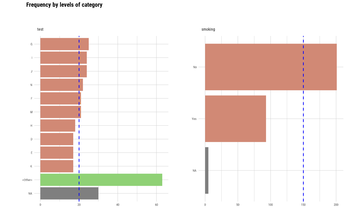
plot_bar_category(heartfailure2, "test", "smoking")
# Select the variable to diagnose
plot_bar_category(heartfailure2, "test", "smoking")
 # Visualize the each plots
# Visualize just 7 levels of top frequency
# Visualize only factor, not character
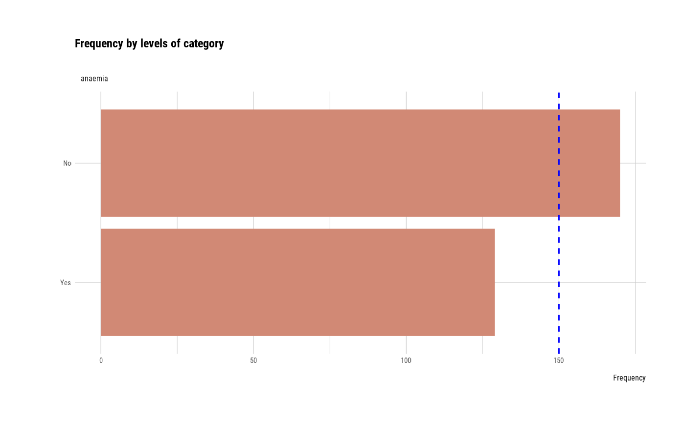
plot_bar_category(heartfailure2, each = TRUE, top = 7, add_character = FALSE)
# Visualize the each plots
# Visualize just 7 levels of top frequency
# Visualize only factor, not character
plot_bar_category(heartfailure2, each = TRUE, top = 7, add_character = FALSE)
 # Not allow typographic argument
plot_bar_category(heartfailure2, typographic = FALSE)
# Not allow typographic argument
plot_bar_category(heartfailure2, typographic = FALSE)
 # Using pipes ---------------------------------
library(dplyr)
# Using groupd_df ------------------------------
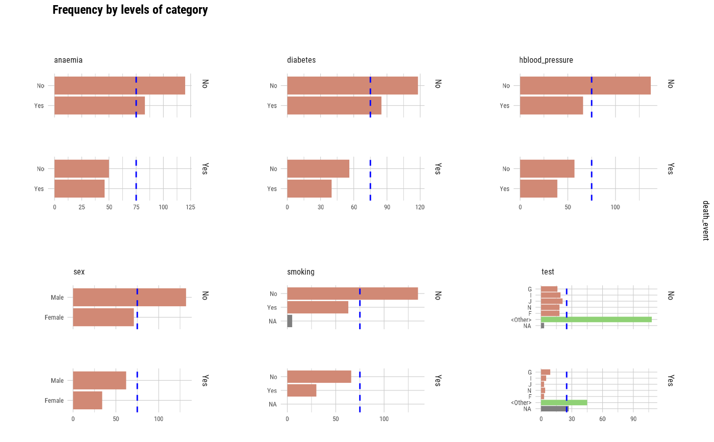
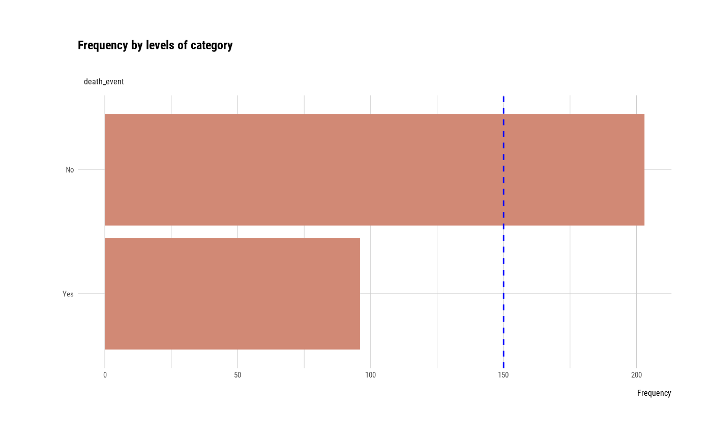
heartfailure2 %>%
group_by(death_event) %>%
plot_bar_category(top = 5)
# Using pipes ---------------------------------
library(dplyr)
# Using groupd_df ------------------------------
heartfailure2 %>%
group_by(death_event) %>%
plot_bar_category(top = 5)