Visualize pareto chart for variables with missing value.
plot_na_pareto(
  x,
  only_na = FALSE,
  relative = FALSE,
  main = NULL,
  col = "black",
  grade = list(Good = 0.05, OK = 0.1, NotBad = 0.2, Bad = 0.5, Remove = 1),
  plot = TRUE,
  typographic = TRUE,
  base_family = NULL
)
Arguments
- x
data frames, or objects to be coerced to one.
- only_na
logical. The default value is FALSE. If TRUE, only variables containing missing values are selected for visualization. If FALSE, all variables are included.
- relative
logical. If this argument is TRUE, it sets the unit of the left y-axis to relative frequency. In case of FALSE, set it to frequency.
- main
character. Main title.
- col
character. The color of line for display the cumulative percentage.
- grade
list. Specifies the cut-off to set the grade of the variable according to the ratio of missing values. The default values are Good: [0, 0.05], OK: (0.05, 0.1], NotBad: (0.1, 0.2], Bad: (0.2, 0.5], Remove: (0.5, 1].
- plot
logical. If this value is TRUE then visualize plot. else if FALSE, return aggregate information about missing values.
- typographic
logical. Whether to apply focuses on typographic elements to ggplot2 visualization. The default is TRUE. if TRUE provides a base theme that focuses on typographic elements.
- base_family
character. The name of the base font family to use for the visualization. If not specified, the font defined in dlookr is applied. (See details)
Value
a ggplot2 object.
Details
The base_family is selected from "Roboto Condensed", "Liberation Sans Narrow", "NanumSquare", "Noto Sans Korean". If you want to use a different font, use it after loading the Google font with import_google_font().
Examples
# \donttest{
# Generate data for the example
set.seed(123L)
jobchange2 <- jobchange[sample(nrow(jobchange), size = 1000), ]
# Diagnose the data with missing_count using diagnose() function
library(dplyr)
jobchange2 %>%
diagnose %>%
arrange(desc(missing_count))
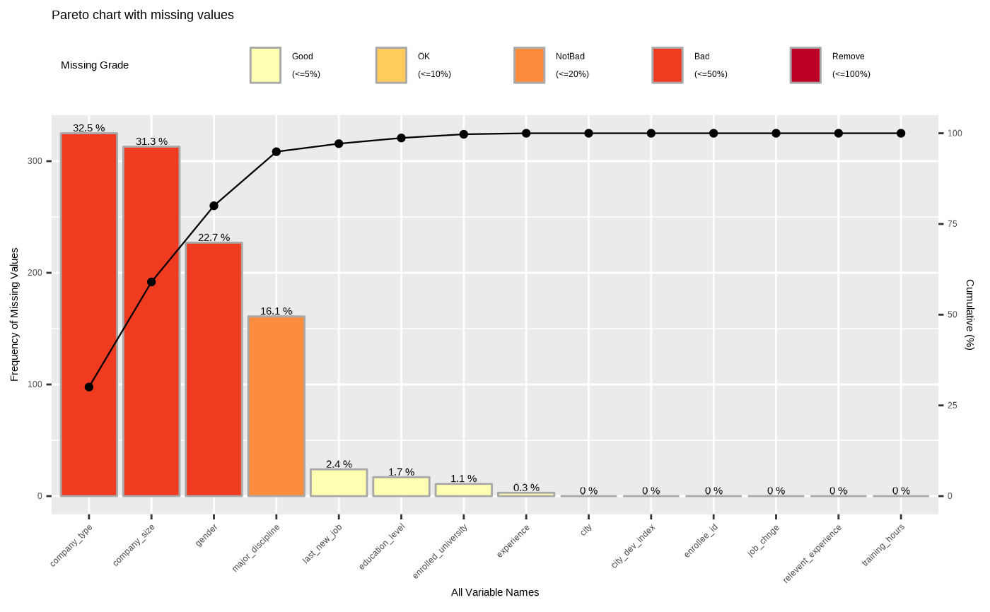
#> # A tibble: 14 × 6
#> variables types missing_count missing_percent unique_count unique_rate
#> <chr> <chr> <int> <dbl> <int> <dbl>
#> 1 company_type fact… 325 32.5 7 0.007
#> 2 company_size orde… 313 31.3 9 0.009
#> 3 gender fact… 227 22.7 4 0.004
#> 4 major_discipline fact… 161 16.1 7 0.007
#> 5 last_new_job orde… 24 2.4 7 0.007
#> 6 education_level orde… 17 1.7 6 0.006
#> 7 enrolled_univer… fact… 11 1.1 4 0.004
#> 8 experience orde… 3 0.3 23 0.023
#> 9 enrollee_id char… 0 0 1000 1
#> 10 city fact… 0 0 88 0.088
#> 11 city_dev_index nume… 0 0 72 0.072
#> 12 relevent_experi… fact… 0 0 2 0.002
#> 13 training_hours inte… 0 0 194 0.194
#> 14 job_chnge fact… 0 0 2 0.002
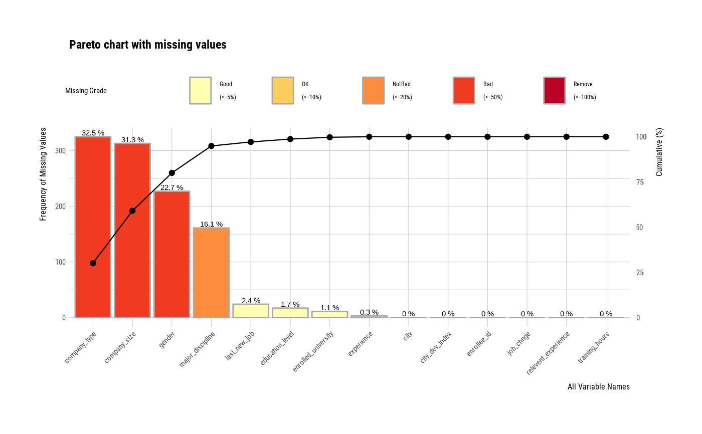
# Visualize pareto chart for variables with missing value.
plot_na_pareto(jobchange2)
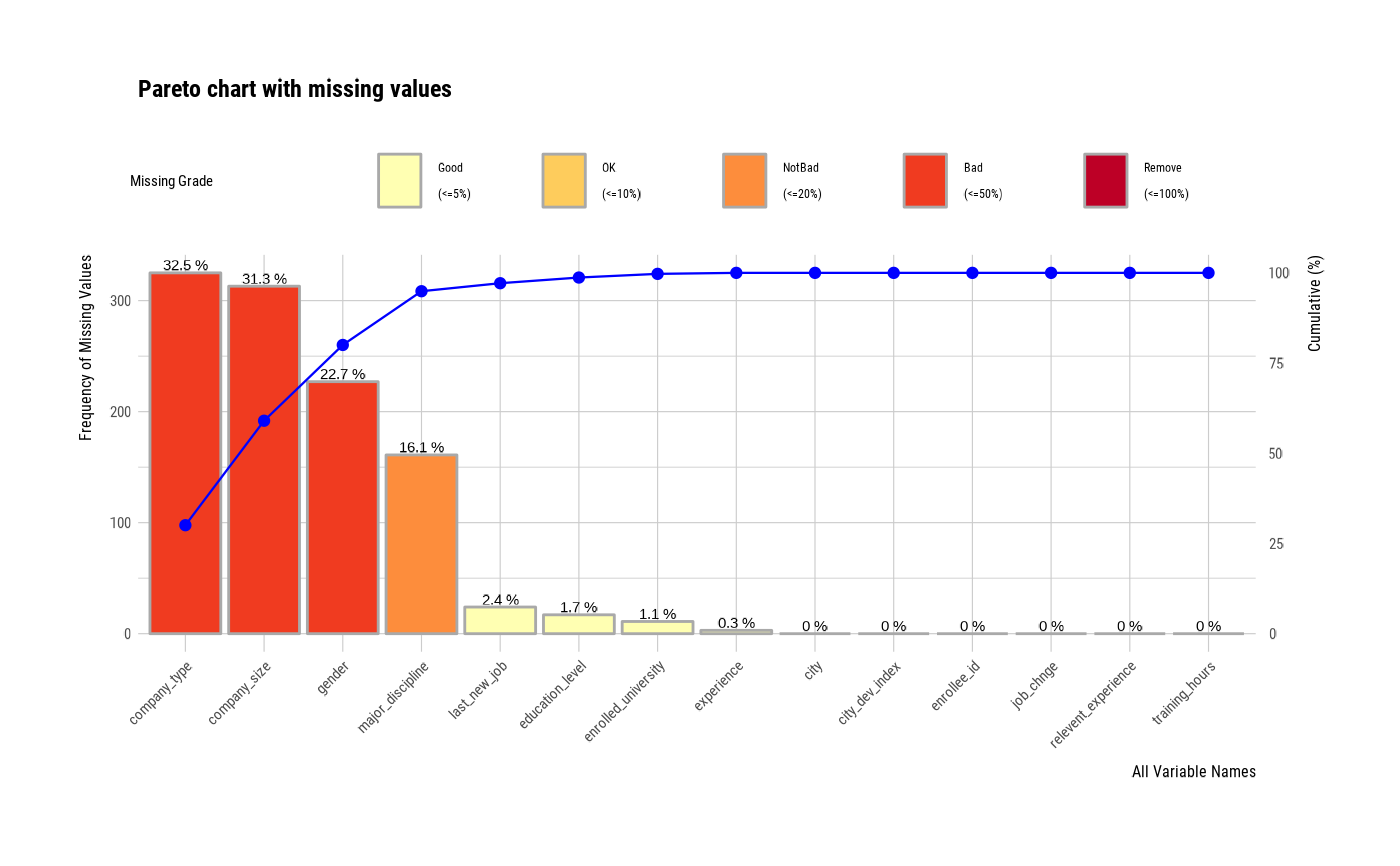
 # Visualize pareto chart for variables with missing value.
plot_na_pareto(jobchange2, col = "blue")
# Visualize pareto chart for variables with missing value.
plot_na_pareto(jobchange2, col = "blue")
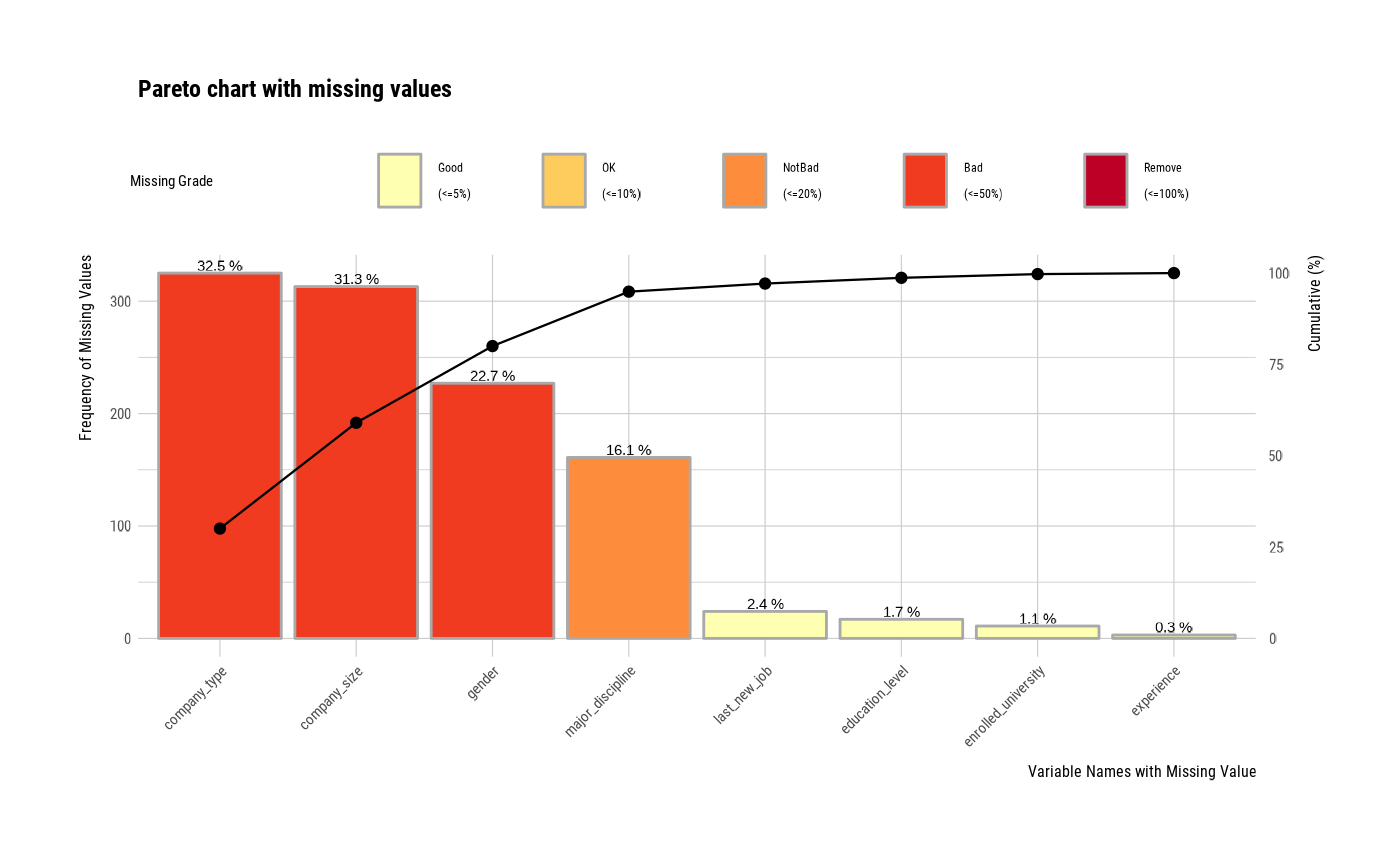
 # Visualize only variables containing missing values
plot_na_pareto(jobchange2, only_na = TRUE)
# Visualize only variables containing missing values
plot_na_pareto(jobchange2, only_na = TRUE)
 # Display the relative frequency
plot_na_pareto(jobchange2, relative = TRUE)
# Display the relative frequency
plot_na_pareto(jobchange2, relative = TRUE)
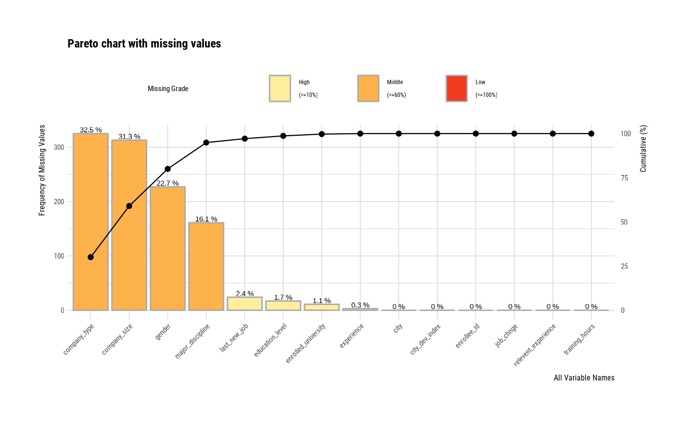
 # Change the grade
plot_na_pareto(jobchange2, grade = list(High = 0.1, Middle = 0.6, Low = 1))
# Change the grade
plot_na_pareto(jobchange2, grade = list(High = 0.1, Middle = 0.6, Low = 1))
 # Change the main title.
plot_na_pareto(jobchange2, relative = TRUE, only_na = TRUE,
main = "Pareto Chart for jobchange")
# Change the main title.
plot_na_pareto(jobchange2, relative = TRUE, only_na = TRUE,
main = "Pareto Chart for jobchange")
 # Return the aggregate information about missing values.
plot_na_pareto(jobchange2, only_na = TRUE, plot = FALSE)
#> # A tibble: 8 × 5
#> variable frequencies ratio grade cumulative
#> <fct> <int> <dbl> <fct> <dbl>
#> 1 company_type 325 0.325 Bad 30.1
#> 2 company_size 313 0.313 Bad 59.0
#> 3 gender 227 0.227 Bad 80.0
#> 4 major_discipline 161 0.161 NotBad 94.9
#> 5 last_new_job 24 0.024 Good 97.1
#> 6 education_level 17 0.017 Good 98.7
#> 7 enrolled_university 11 0.011 Good 99.7
#> 8 experience 3 0.003 Good 100
# Non typographic elements
plot_na_pareto(jobchange2, typographic = FALSE)
# Return the aggregate information about missing values.
plot_na_pareto(jobchange2, only_na = TRUE, plot = FALSE)
#> # A tibble: 8 × 5
#> variable frequencies ratio grade cumulative
#> <fct> <int> <dbl> <fct> <dbl>
#> 1 company_type 325 0.325 Bad 30.1
#> 2 company_size 313 0.313 Bad 59.0
#> 3 gender 227 0.227 Bad 80.0
#> 4 major_discipline 161 0.161 NotBad 94.9
#> 5 last_new_job 24 0.024 Good 97.1
#> 6 education_level 17 0.017 Good 98.7
#> 7 enrolled_university 11 0.011 Good 99.7
#> 8 experience 3 0.003 Good 100
# Non typographic elements
plot_na_pareto(jobchange2, typographic = FALSE)
 # }
# }